Before you buy a ready-made e-commerce site, check the failure modes first. The package may look complete in a sales sheet, but the real test is whether it helps you launch, operate, and change the store without digging through hidden fees or waiting on support for every small update.
Readers usually come to this decision with the same questions in mind: What should already be included? What will I still have to buy later? How much of the store can I control myself? And what breaks first when traffic, products, or order volume starts to grow? Those are the right questions. The wrong question is only, “What is the cheapest option?”
Two public references are worth keeping in view while you compare packages. Baymard’s checkout research keeps showing how much friction in the final steps can damage conversion, and Google’s SEO Starter Guide still treats search visibility as a matter of structure, clarity, and crawlable content, not decoration. That is why the safest way to buy a ready-made store is to inspect the basics before you are impressed by the theme.
This checklist will help you compare package features in a controlled way so you can decide whether the store supports sales, operations, and future updates. It is designed for buyers who want a normal working site, not a stack of promises that turns into maintenance debt after launch.
That matters because ready-made e-commerce packages are often sold as time savers, but the real savings only appear when the package reduces daily effort. If the store still needs a developer for every banner change, a manual workaround for every shipping rule, or a separate plugin for every small function, you are not buying a package. You are buying a queue.
- Storefront basics every package should include
- Product, cart, and checkout essentials
- Payment and shipping options
- Mobile usability and admin control
- SEO and content management basics
- Red flags in low-cost packages
Terms to know before you compare packages
Package brochures often use the same words for very different things. If you do not define the basics, you can compare two offers that are not actually equal.
For a buyer, the point of these definitions is not vocabulary trivia. It is control. When a vendor says “CMS,” you need to know whether that means a few editable sections or a genuinely manageable publishing system. When they say “checkout,” you need to know whether it includes address validation, confirmation emails, and a sane retry path after a failed payment.
| Term | What it should mean in practice | What to verify |
|---|---|---|
| Storefront | The public-facing pages customers browse before they buy. | Responsive layout, clear navigation, search, category pages, product pages. |
| Cart | The temporary holding area for selected products. | Quantity edits, remove buttons, saved totals, clear shipping/tax logic. |
| Checkout | The final path from intent to paid order. | Few steps, guest checkout, secure payment, error handling, order confirmation. |
| CMS | The content system used to update text, pages, and often blog posts. | Editable pages, product content, banners, SEO fields, media handling. |
| Gateway | The payment service that processes card or wallet transactions. | Supported methods, fees, payout timing, refund handling, test mode. |
1) Storefront basics every package should include
The storefront is the first gate. If it confuses visitors, the rest of the package has to work harder than it should. **A good package should help the buyer understand the offer in seconds, on any device, without looking broken or dated.**
The most important baseline is responsive design. Google’s mobile-first indexing guidance is blunt about this: the mobile version needs to be complete and accessible because that is what search systems and many users will see first. That means the store should not merely shrink to fit a phone. It should remain readable, usable, and complete.
For accessibility and readability, the page should also reflow cleanly when text grows or the screen narrows. The W3C’s reflow guidance is a useful reminder that horizontal scrolling and trapped layouts create avoidable friction. If the demo store only looks good at one desktop width, it is not ready.
Here is the storefront checklist I would use before I bought any package:
- Responsive layout that stays usable on phones, tablets, and laptops.
- Clean header navigation with categories that make sense to a new visitor.
- Search that returns relevant results and handles misspellings gracefully.
- Theme or template controls that let you adjust colors, typography, and sections without code.
- Homepage sections that can be changed without rebuilding the entire site.
- Product cards that show price, availability, and a clear call to view details.
There is a practical reason to insist on these basics. A package that saves time during launch but makes every future edit expensive has simply moved the cost into the operating phase. That is the wrong end of the budget curve.
Example: if you sell clothing, your store should not force every variant into a separate product page just because the package was designed for a simple catalog. A proper store package should let one product carry sizes, colors, stock levels, and clear selection options without turning the catalog into a spreadsheet exercise. That is the difference between a storefront that scales and one that merely exists.
If you want to see how the broader site is positioned before you compare a package, start at the homepage and the explanation page for WTicaret Nedir?. Those pages should help you judge whether the package matches the site’s overall structure and service model.
2) Product, cart, and checkout essentials
This is where many low-cost packages get thin. They show products well enough in a demo, then quietly limit how those products behave in real use. A store buyer should check the package with an operator’s eye, not a designer’s eye.
At the product level, the package should support categories, filters, variants, stock status, pricing rules, and clear product detail pages. If you sell sizes, colors, bundles, or seasonal groups, the package must handle those structures without forcing awkward workarounds. Product management is not a side feature. It is the core of the store.
At the cart level, buyers should be able to change quantities, remove items, continue shopping, and see totals update without confusion. A cart that hides shipping, taxes, or discount logic until the last screen creates mistrust. That kind of surprise is not a selling technique. It is a failure mode.
Checkout is the critical path. Baymard’s checkout usability research has long argued that small design mistakes compound quickly at the point of payment. You do not need to memorize the research to benefit from it. You only need to ask a simple question: does this package make it easy for a cautious buyer to finish the order?
When you compare checkout features, verify these points:
- Guest checkout is available unless your business model genuinely needs account-first ordering.
- Checkout uses a small number of steps and does not ask for redundant information.
- Error messages are clear, visible, and specific.
- Coupons, shipping methods, and taxes update without page confusion.
- Order confirmation is obvious and includes a reliable next step.
- Email notifications and order history are available to both customer and admin.
If the package has a strong storefront but a weak checkout, do not talk yourself into it. Checkout is not where you want to discover design debt. That debt charges interest every day.
One useful test is to create a cart with multiple items, apply a discount code, switch shipping methods, and complete the order from a phone. If the experience becomes confusing at any step, the package needs more than a theme refresh. It needs a serious review of the transaction flow. A store that cannot handle its own happy path will struggle with returns, failed payments, and customer questions later.
3) Payment and shipping options
Payment and shipping are the operating rules of the store. They decide whether the package works in the real world or only in a demo with one idealized path.
First, check payment coverage. The package should support multiple gateways or at least integrate cleanly with the gateway you plan to use. A buyer should be able to add common payment methods later without rebuilding the site. Ask how card payments, wallet options, bank transfer, cash on delivery, or other local methods are handled in the package. Even if you do not need every method on day one, the store should not trap you into a dead-end setup.
Second, check shipping logic. Real-time shipping calculation is valuable because it reduces manual correction. If the package cannot calculate shipping by weight, zone, service, or order total, you may end up doing rate work by hand. That becomes painful fast. Integration with major carriers is useful only if the rules remain visible and editable from the admin side.
Third, check the admin workflow for payment and shipping exceptions. Refunds, cancelled orders, partial shipments, and failed payments are not edge cases. They are part of the business. The package should give you a way to review, correct, and document them without hunting through separate systems.
Example: a package might advertise “multiple shipping options,” but if each new zone requires code edits or a support ticket, the feature is effectively limited. Ask how those rules are edited, who can change them, and whether you can add seasonal delivery options without breaking the existing setup. The same question applies to taxes, invoice formatting, and payment settlement records.
Use this mini checklist before you buy:
| Area | Minimum expectation | Red flag |
|---|---|---|
| Payment | At least one secure gateway with room for expansion. | Only one hardwired payment path with no clear upgrade path. |
| Shipping | Configurable zones, methods, and pricing rules. | Flat, vague shipping fields that force manual edits. |
| Exceptions | Clear handling for refunds, cancellations, and failed orders. | Support tickets required for every adjustment. |
If the package promises “simple setup” but hides the complexity from the admin, be careful. Hidden complexity is still complexity. It just arrives later.
4) Mobile usability and admin control
Buyers tend to focus on the front end, but the store owner lives in the back end. A good package makes both sides practical. **If the admin area is confusing, every product update becomes slower than it should be.**
On mobile, the store should keep the same functional content rather than stripping important information away. Google’s mobile-first guidance is useful here because it treats mobile parity as a normal requirement, not a luxury. A store that hides product details, support links, or important policies on smaller screens is creating avoidable friction.
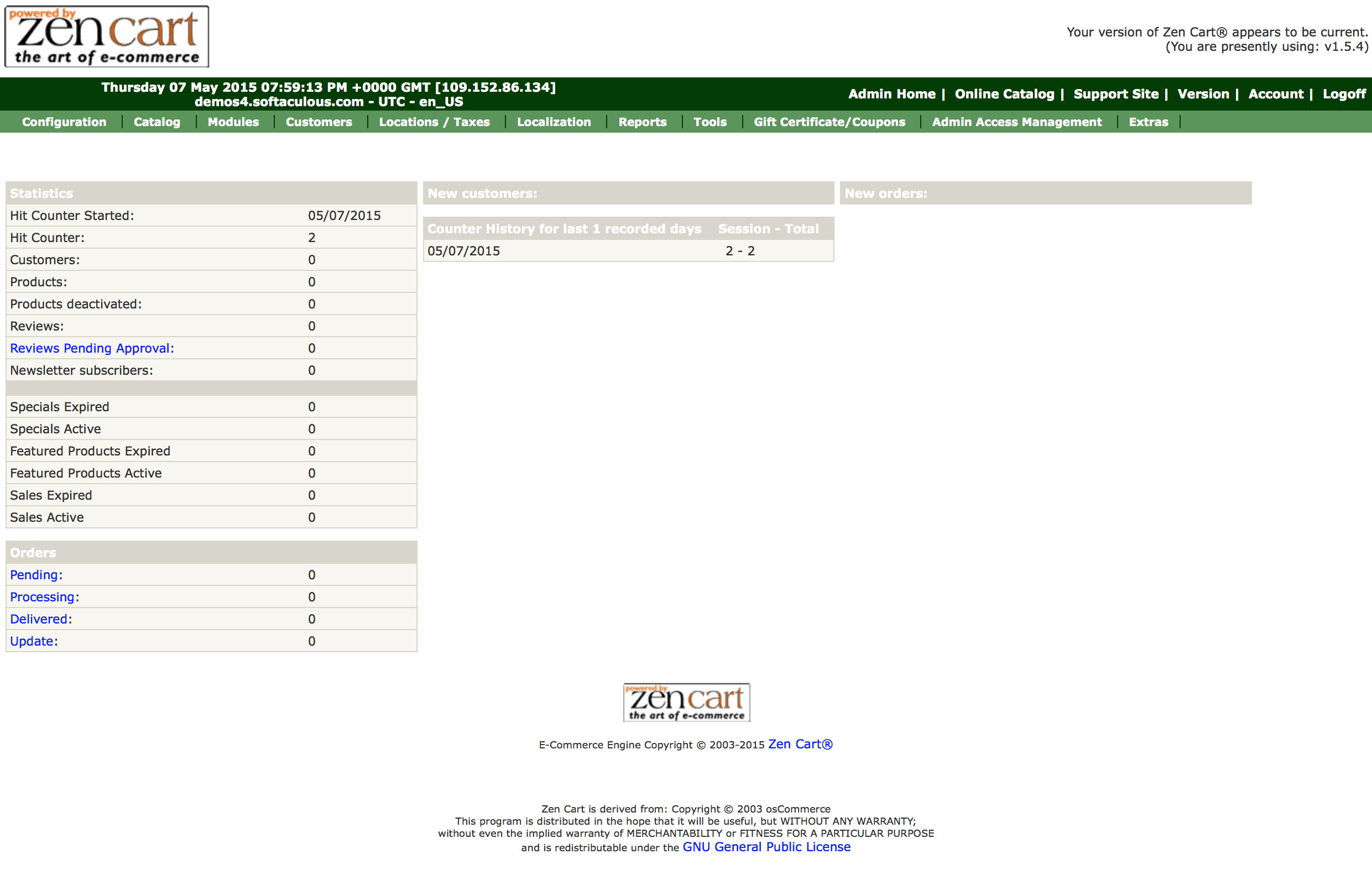
The admin control panel should show the essentials quickly: products, inventory, orders, and reporting. The screenshot in this article is the kind of visual proof you should expect from a package demo. Not pretty for the sake of it. Useful for the sake of control.
When evaluating admin usability, look for these signs:
- A dashboard that surfaces orders, low stock, and recent activity without too many clicks.
- Simple product editing with support for images, descriptions, categories, and SEO fields.
- Export tools for orders and customer records.
- Role-based access if more than one person will manage the store.
- Reporting that shows sales trends, order volume, and item movement without a spreadsheet detour.
- Support for password discipline, two-factor authentication, and other basic account protections where available.
For the layout side of mobile usability, the W3C’s reflow guidance is worth remembering because it addresses the exact problem that many demos hide: a site can look fine while still being awkward to operate. If a text block, button, or admin panel needs sideways scrolling on a phone, that is a warning sign, not a minor inconvenience.
Admin control also includes the speed of everyday work. A store that requires six clicks to update a price or three separate screens to publish a product photo drains attention from real operations. A better package keeps the common tasks close together, provides understandable labels, and does not punish the person maintaining the site for being busy. Busy operators are normal. The interface should be ready for that fact.
When the package includes both a usable mobile storefront and a sensible admin console, the store is easier to run. That matters more than people admit during the buying stage.
5) SEO and content management basics
Search visibility is not an extra layer you add later if there is time left. It belongs in the package from the start. Google’s SEO Starter Guide is a useful reminder that search engines need structure they can understand. If the package cannot support that structure, you will spend more time repairing the site than growing it.
At minimum, the package should let you edit page titles, meta descriptions, headings, image alt text, URLs, and internal links. Product pages should not be locked behind hard-coded templates. Content management should be simple enough that a non-developer can update a banner, publish a new page, or adjust a landing page without waiting on a support queue.
There is also a larger content question. Can the package support blogging or editorial pages? For many stores, the answer should be yes. A blog or guide section helps you explain products, answer buyer questions, and build topical depth around the store. That is why the blog index matters as part of the site structure, not as an afterthought.
If the package exposes product schema or merchant listing markup, that is a practical advantage. Google’s merchant listing structured data guidance explains the kind of product data search systems expect. You do not need to become a schema specialist to benefit from this. You only need to know whether the package lets you present products clearly enough for both visitors and search systems.
In practice, the SEO/content checklist looks like this:
- Editable title tags and meta descriptions for products and pages.
- Clean URLs and controllable slugs.
- Image alt text and caption support.
- Blog or article support for product education and trust content.
- Internal linking options from content pages to products and category pages.
- Basic analytics or reporting so you can see whether updates are working.
SEO done well is quiet work. It should not require heroics. If the package makes every content change a technical project, then it is not really supporting ownership.
Example: you should be able to create a category page for a seasonal collection, edit the title, assign a target keyword naturally, set a clean URL, and link to related products without waiting on a developer. You should also be able to redirect old URLs when products change, because stores evolve. A package that cannot handle that much is usually too rigid for real commerce.
6) Red flags in low-cost packages
This is the part buyers regret skipping. Low-cost packages can be perfectly acceptable, but only if the price is low because the scope is narrow, not because the essentials were removed and renamed.
Watch for these warning signs:
- No customer support path, or support that is vague about response times.
- Limited customization that makes basic changes expensive or impossible.
- Hidden fees for setup, updates, plugin additions, or basic maintenance.
- No ownership clarity for domain, hosting, content, or exported data.
- Theme limitations that block normal store growth, such as extra languages, extra product types, or more than one shipping rule.
- A demo that looks polished but skips the admin area entirely.
One more red flag matters more than the others: unclear handoff. If you cannot tell who owns the site, who has login access, and how you recover the store if a vendor disappears, the package is too risky. Good infrastructure should reduce dependency, not increase it.
That includes basic recovery questions. Where are the backups stored? How fast can the site be restored? Who controls the domain and SSL certificate? Who can export product and order data? These are not the kind of questions that make a sales conversation warm and friendly, but they are the questions that save money when something breaks. A store package should have a recovery path, not just a launch path.
That is also why I recommend comparing any package against your own operating needs before you compare it against another seller’s pitch. Ask yourself what you need on day one, what you need after the first 100 products, and what you need when you are no longer comfortable with manual workarounds. If the package fails those tests, the price is already wrong.
Bottom line
A ready-made e-commerce site should save time without stealing control. The safest packages give you a usable storefront, a complete checkout path, practical payment and shipping logic, a mobile-friendly experience, and a back end you can actually operate. That is the baseline. Anything below it is a short-term convenience with a long-term bill.
Before you buy, compare the package against this sequence: storefront, product handling, cart and checkout, payment and shipping, mobile and admin control, SEO and content management, then support and ownership. If one of those layers is missing, treat it as a real cost, not a footnote.
If you are reviewing a package now, use the Bize Ulaşın page to ask specific questions before you sign anything. A calm question asked early is cheaper than a rushed fix after launch.
Key points to keep:
- Responsive design and clean navigation are not extras.
- Checkout friction is a real business cost.
- Payment and shipping rules must be editable from the admin side.
- Mobile usability and content control matter as much as the theme.
- SEO fields, product data, and blog support should be included in the package.
- Hidden fees, weak support, and unclear ownership are the most common traps.